
Data Visualization guidelines for the CFPB
Expanding the design manual for the Consumer Financial Protection Bureau (a federal government agency) to include a section for data visualization. The data driven agency needed a consistent style to keep their graphics consistent and accessible.
- Date: 2017
- Role: Lead researcher, project manager, content writer and lead designer
- Stakeholders: The Tecnology and Innovation Department at the Consumer Financial Protection Bureau (CFPB)
- Audience: Designers and developers in the Technology and Innovation department and PhD social scientists in the Research Department
- Problem: The overall brand aesthetic was "make everything green" which didn't work well for complex data or 508 accessibility
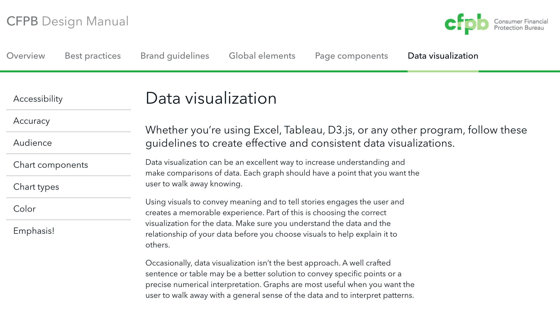


As a data driven government agency, the Consumer Financial Protection Bureau visualizes a lot of data. The audience for these visualizations range from the general public, to reports for congress, and analysts at the bureau who are familiar with the data. All of these users could benefit from charts and graphics that are visually clear and easy to comprehend. Having a style guide for data visualization helps chart creators think though the impact of their visuals. The data visualization design manual provides guidance to designers, business intelligence analysts, researchers and developers to consider who their audience is, and the impacts of what they include in a title, some basics for accessibility, as well as keeping everything feeling like CFPB.
The process of creating standards for an already existing organization started with collecting examples of existing visualizations, analyzing similarities and differences, and determining where the organization wanted to go with it's visual system for data. Prior to implementing the data visualization design manual, the organization used a wide variety of chart types, with an abundant use of the brand green as the only way of providing cohesion.
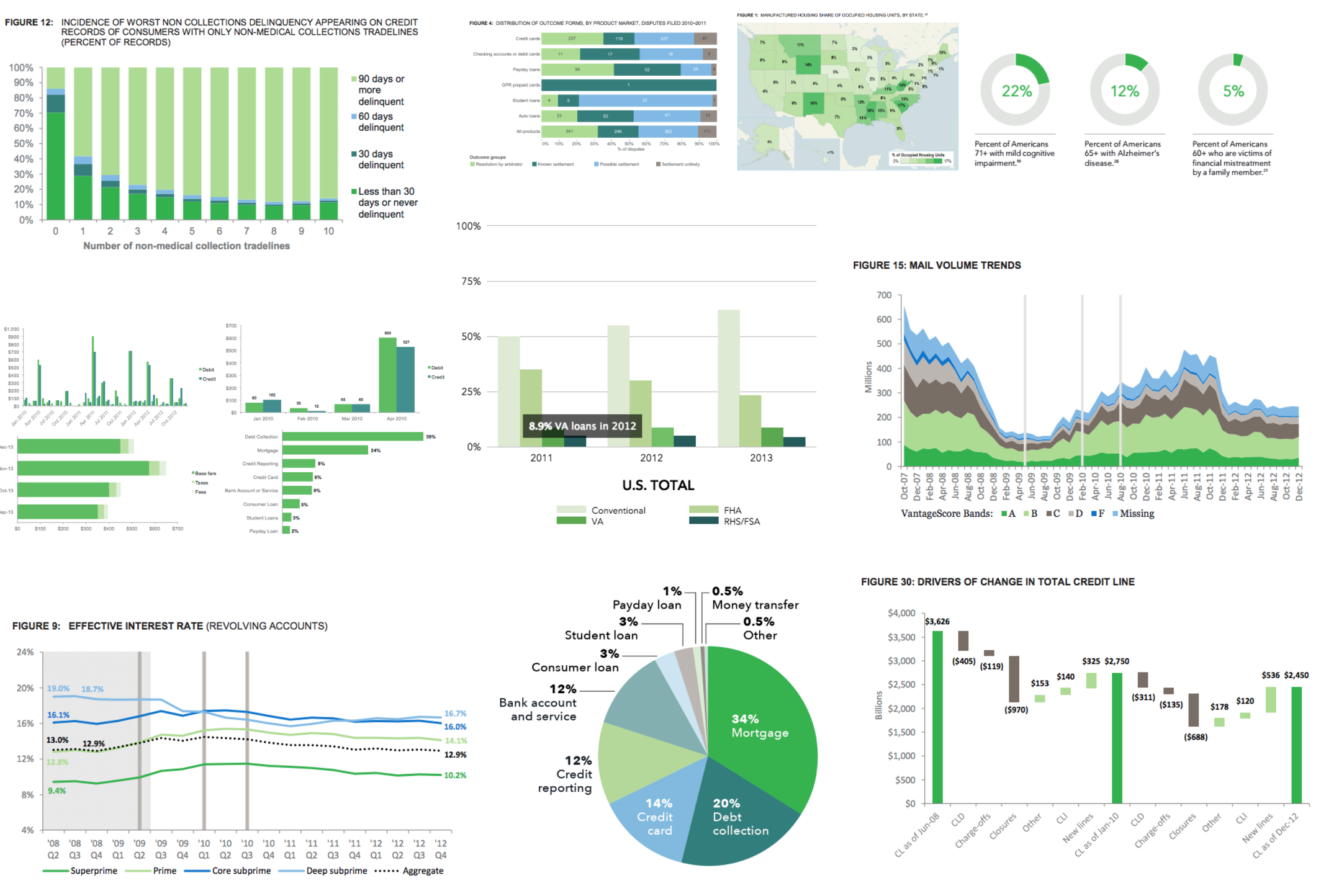
Bar Chart Bonanza!
In order to explore the possibilities of extending and re-imagining the brand, a small group of designers played with 2 sets of data and created as many different charts as we could. Not all of the examples were good visualizations, but it helped us determine what we want to encourage and standardize, and what we want to avoid.


Shaping content
Because not every data visual is going to be created with the help of a designer, the guide needed to provide basic explanations and education about how we want the organization to think about and produce visualizations. It also needed to be quick and easy so people would actually use it.
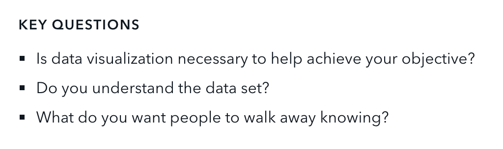
Each section has a short list of key questions. These are meant to be thought provoking and guide the chart creator in making the best visual for their data and audience.

Color
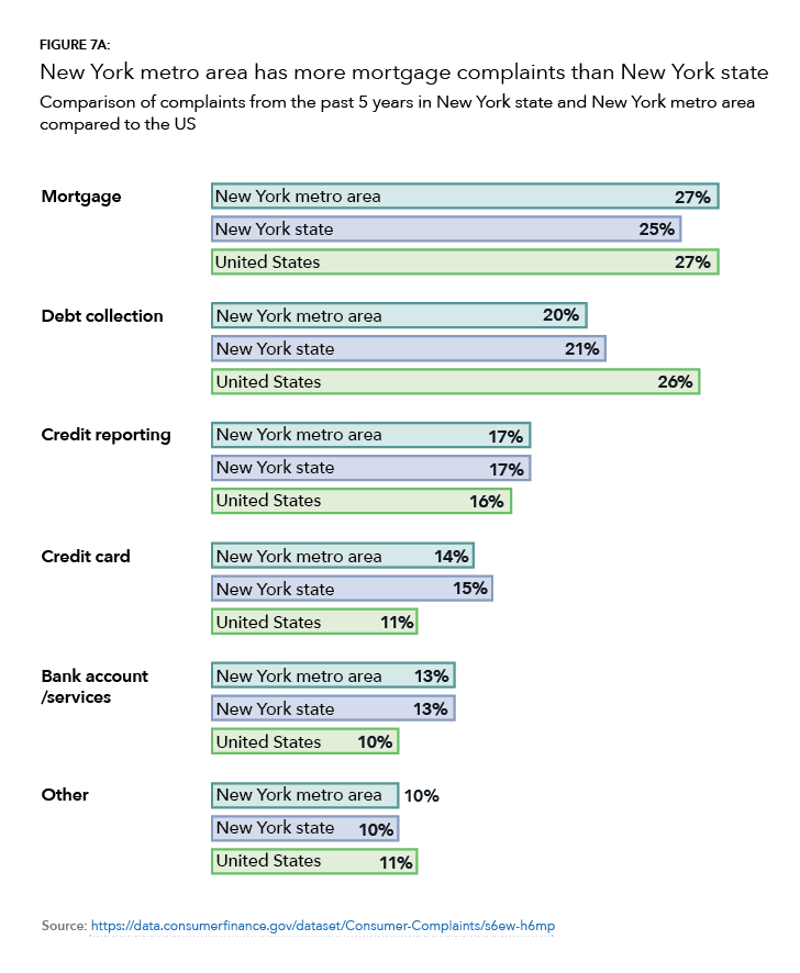
Providing a wider variety of colors than just the brand green is necessary. Before the expanded palette, almost every chart was in green, no matter what it showed. When every chart looks the same, it makes it more difficult to connect similar types of data across a long report. Having multiple colors in the extended palette allows for the use of different color families for substantively different types of data. There are now 16 colors that look cohesive together, but different enough that they can be differentiated.

The guide also places an emphasis on explaining color blindness, and why it's important to account for that in visuals.
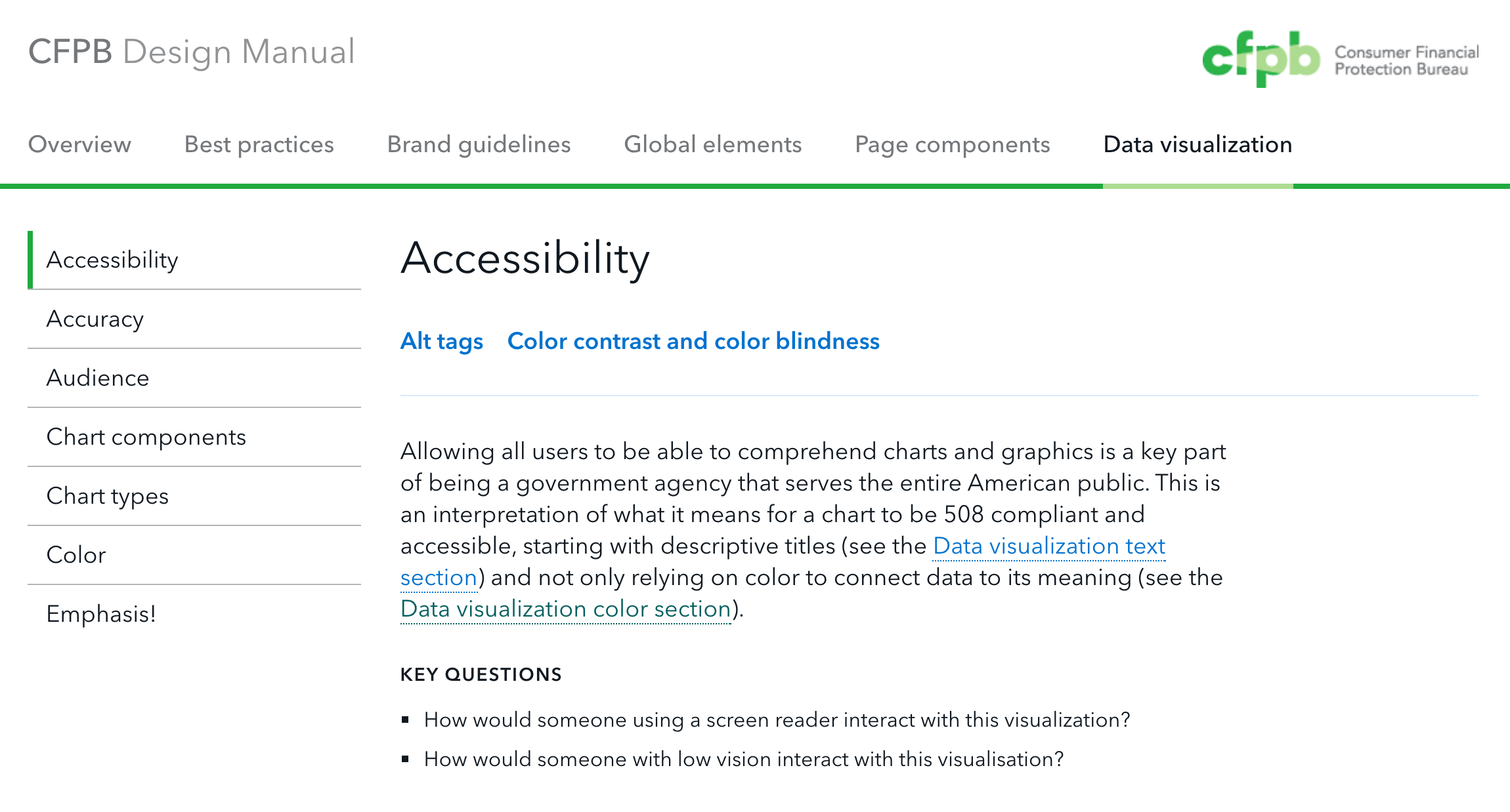
As a government agency we need to be section 508 compliant, and accounting for these needs is built into the basics of the guide. This includes things like having descriptive titles on charts to help the user understand the chart. It is important not over rely on color for meaning, and have direct labels or patterns in order to help people identify different groups.
For alt tags, the chart type is included for users who might be partially sighted and using a screen reader to supplement their experience. The guide also encourages including a short description of the point of the graph. It is best practice to include a link to a csv or other sheet of data, so that users who can’t see can tab through the data and get a sense of trends. Additionally, including data along with charts facilitates transparency, which is one of CFPB's goal.

Internal Impact
Since the standards have been released, I've had multiple consultations with co-workers to talk about their data visualization and how it could be better for their users and better align with the over brand. My fellow designers look to me as an expert and a mentor to help them learn about best practices in data visualization. I've also helped with the creation of multiple templates that use these standards for programs like Tableau, R, and Stata. This allows people to use the software they are comfortable with, but still make charts that look and feel like CFPB.
External Impact
I spoke to 500+ leading data visualization specialists about data visualization style guidelines, on behalf of CFPB at Open Vis Conf in 2017. It demonstrated that the bureau is taking its data visualization to the next level and set the standard for some best practices.

“Think of a large organization, with multiple people making multiple visualizations over time, using multiple tools. Inevitably, people will end up making visualizations that look very different.
Amy Cesal introduces style guides for visualizations in organizations. Style guides enable users to create visualizations that look related through documentation and example visualizations.”

“Scaling the process conversation up, Amy made a strong case for the use of visualization style guides in the work of medium-to-large organizations. In addition to cleaning up and standardizing look and feel, visualization style guides offer the added benefits of increasing production speed and accessibility.”
