
Data visualization for the Sunlight Foundation
At the Sunlight Foundation I worked closely with our in-house researchers to build consistently-branded, high-impact data visualizations to accompany reports, blog posts and for sharing on social media.
- Date: 2012-2014
- Role: Lead Designer
- Stakeholders: Research fellows in the Labs Department and reporters at the Sunlight Foundation.
- Audience: Journalists and government + technology thought leaders
- Problem: Blog posts needed visuals to convey complex data and analysis in a consistent and accurate manner. They needed to flow in blog posts and reports, but stay branded if they were pulled out by journalists or on social media
Congress in 2013

Bar graphs are boring. Data that looks basically the same is even more boring.
It was a challenge to show that Congress in 2013 was slightly more productive than in 2011, but both years saw only the tiniest sliver of introduced bills become law.
In order to show the true effect of how rare it is for introduced legislation to pass a single chamber, let alone become law, I chose a slightly unconventional size for the bar graph. It draws interest by having an unusually long y axis, and highlights true differences without destroying the integrity of the data by only showing the variance between the 2 years.
Call-outs feature the disparity between the years and draw attention to key points.
View the full post at: sunlightfoundation.com/blog/2014/01/16/congress-in-2013
Revolving Door Lobbyists
Data visualizations and illustrations for part of a 5 post series on how it benefits lobbyists to have government experience. The challenge was to make the term and the monetary discrepancies behind "revolving door lobbyists" understandable and still covey all the necessary complexities.
View the full post at: sunlightfoundation.com/blog/2014/01/21/revolving-door-lobbyists-government-experience


The Political 1% of 1% in 2012
In the 2012 election, 28 percent of all disclosed political contributions came from just 31,385 people. In a nation of 313.85 million, these donors represent the 1% of the 1%, an elite class that increasingly serves as the gatekeepers of public office in the United States. At the Sunlight Foundation, two data analysts and researchers, along with me, created a large analysis with multiple posts, and data visualizations sprinkled through each analysis post.
See the full analysis at http://sunlightfoundation.com/blog/2013/06/24/1pct_of_the_1pct/
How do you visualize the 31,358 people that are a large influence of money in political elections? I used a football stadium as a visual metaphor. The controversial home team of Washington DC, the Redskins, to pull the nation's capitol back in the focus. However, it works well that FexEx field is pretty average in size to other NFL team fields, so the metaphor works well across the country. By breaking a large number down into a population that most people can see in their mind, it pushes across the point of how small this group is, and what kind of elite influence they have in politics.
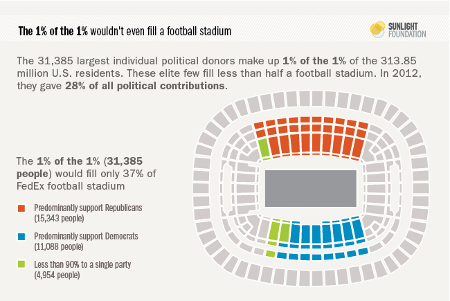

Not a single member of the House or Senate elected last year won without financial assistance from this elite group of donors. A slightly unexpected, but accurate way to visualize this fact is a 100% pie chart. it emphasizes the point that ALL of congress received money. And the data nerds find it amusing.
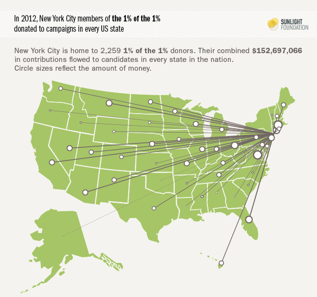
A similar concept is a map showing which states people from New York City have donated money and influenced elections in 2012. Every state is highlighted, showing the broad influence.
Political Party Time 5 year analysis
Political Party Time is a database of documents and invitations from the political fundraising circuit collected by the Sunlight Foundation. To celebrate the 5 year anniversary of this project, I created a retrospective analysis with the help of data analyst Ben Chartoff and reporter Kathy Kiely. The style picks up from the Political Party Time website, and includes both entertaining visuals and investigative analysis.
The full post: sunlightfoundation.com/blog/2013/09/17/five-years-of-political-party-time
A lighthearted infographic that pulls out some of the big numbers and highlights fun facts from the last five years of data with simple illustrations. This infographic was enthusiastically shared on social media.
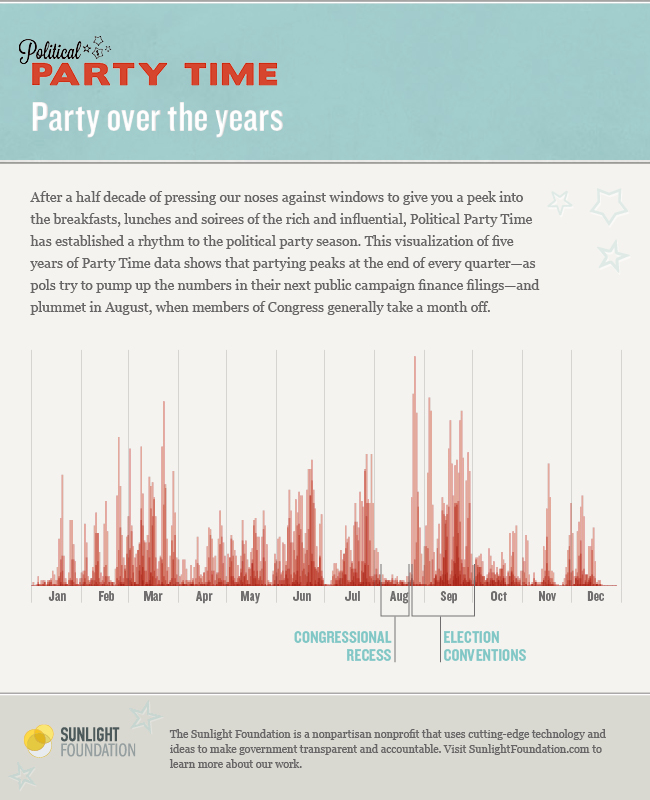
The data showed what time of the year political parties occurred more visibly when all five years of data were overlaid. It's easy to detect the peaks and valleys by the intensity of the red.
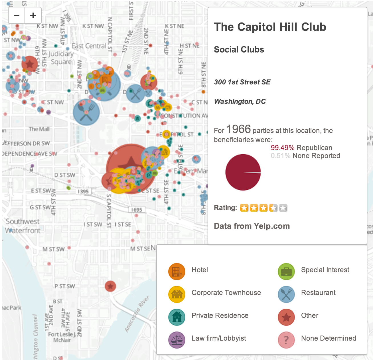

Created using Mapbox, the custom interactive map plots the type and size of each fundraiser. Where possible, we pulled in data from yelp to give more context to the venue. With this visual, the ring of influence around Capital Hill is apparent.
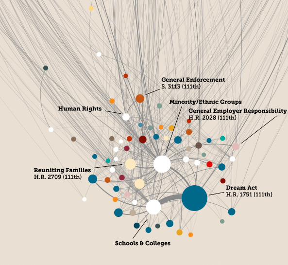
Untangling the webs of immigration lobbying

Network graphs usually look like hairballs. And rarely do they make sense to anyone, except maybe the creator.
But, when Sunlight Foundation wanted to analyze almost 8,000 lobbying reports as Congress inched toward major immigration legislation, and create a comprehensive and interactive guide to the web of interests with something at stake, visually untangling the giant lobbying network graph proved to be the correct approach.
By visually containing and labeling each cluster's influence, the network becomes accessible and understandable. The post went into more detail about each cluster and smaller graphics showed the major entities in each grouping.
View the full post at: sunlightfoundation.com/blog/2013/03/25/immigration
On June 18, 2013, I joined analysts Lee Drutman and Zander Furnas at Data Science DC hosted in the auditorium of George Washington to talk about the project and the process behind it. A one hour video shows the full event and our reflections on the analysis. A short wrap up of the event can be read at: datacommunitydc.org/blog/2013/06/the-value-of-the-data-scientist
Astrology & Congress
An April Fools' Day post for the Sunlight Foundation. Using bulk data, we isolated the birthdays of members of Congress and determined their zodiac signs to assess productivity. The results are astronomically significant.
A pie chart, but influenced by the visual style of an astrology wheel, pokes fun at use of data as meaningful connections.
The network graph and the bar chart use bill co-sponsorship as a relationship indicator, and adds a whimsical take on Sunlight Foundation's visual style to illustrate meaningless data viz.
View the full joke: sunlightfoundation.com/blog/2014/04/01/why-congress-might-be-more-productive-and-less-partisan-than-you-think-part-ii


