TransparencyCamp Unconference hosted by the Sunlight Foundation
TransparencyCamp an “unconference” where hundreds of people come together to share about how to make governments more open and transparent through technology. For three years I got to design for this wonderful and exciting two day event.
- Date: 2012-2014
- Role: Lead designer & event planning committee member
- Stakeholders: Sunlight Foundation staff
- Audience: The open gov community who would be intersted in attending the event
- Problem: The branding had to be loud enough to guide 500+ people through the unconference format in an unfamiliar space, and convey a sense of excitement and energy. The implementation had to be flexible and allow for things to change—such as when lunch food trucks park in unexpected locations.
I was lucky enough to be the main designer and help coordinate the event. This allowed me to learn from mistakes (such as not having enough signage) and to iterate on a visual theme. I went from designing the event with only three weeks’ notice the first year to following a timeline over the course of a year. That process started with making a moodboard in January and closing with a wrap-up blog post after the event ended in early June.
I updated the TransparencyCamp website design, created shirts for staff and volunteers, made signage and mail-merged more than 500 name badges. I also managed the graphics budget and vendors, trained staff volunteers to take photos and even supervised the design and production of a 6' robot named Wallace.
One of the things I love about TransparencyCamp is that it is a large, essentially unscheduled event. You can't plan what is going to happen when you have more than 500 people and a loose schedule of events. The branding had to be loud enough to guide people through this unconference format in an unfamiliar space, and convey a sense of excitement and energy. The implementation had to be flexible and allow for things to change—such as when lunch food trucks park in unexpected locations.
Moodboard for TransparencyCamp
I created a moodboard to set the direction and style for the event. It is shared internally so that all departments can see the direction and have a consistent approach. The event has to have a similar feel to that of to the previous year, but be different enough to be unique.

Moodboard for TransparencyCamp 2013

Moodboard for TransparencyCamp 2014
Shirt Design
Budget limited us to only printing shirts in one color, but we sprung for softer fitted shirts to make the staff less grumbly about wearing them. I chose kiwi green because it's a loud color that not many people wear, and therefore the staff and volunteers would be easily-identifiable. The shirts prominently display the name of the event and organization while still being a little fun and campy.


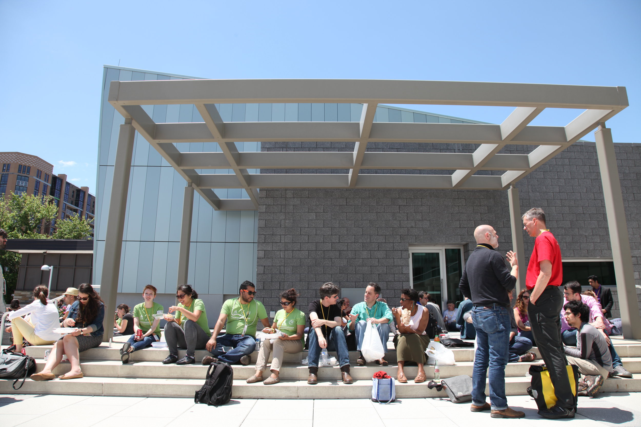
Bright green TransparencyCamp shirts make conference volunteers stand out and easy to find
Tri-fold Name Badge Design
In my third year of designing this unconference, I've learned a lot about optimizing badge design. Having brightly-colored badges and lanyards helps organizers identify attendees at a glance. Badges connected to the lanyard with a single alligator clip flip. Therefore, it's important to put the participant's name on both sides of the badge. Some people in the open data community only know each other by twitter handle, which is just as important as a name to include on the badge.
The trifold badges include a space for TransparencyCamp participants to write the sessions they ended up choosing, so the inside had a white background. The WiFi info was in the badges, as well as every other possible place that we could print or display it because it’s essential for a tech event.
I also used moo.com to create custom stickers for special groups of people that needed to be recognized: press, sponsors, “supercampers” that donated more than the ticket price and ambassador program participants.

“Front” of the TransparencyCamp badge

“Back” of the TransparencyCamp badge

Stacks of conference badges

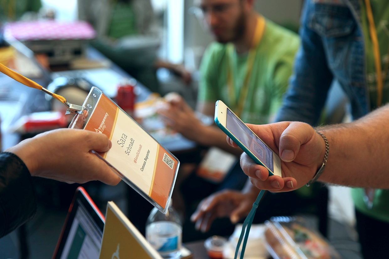
Use of QR Codes
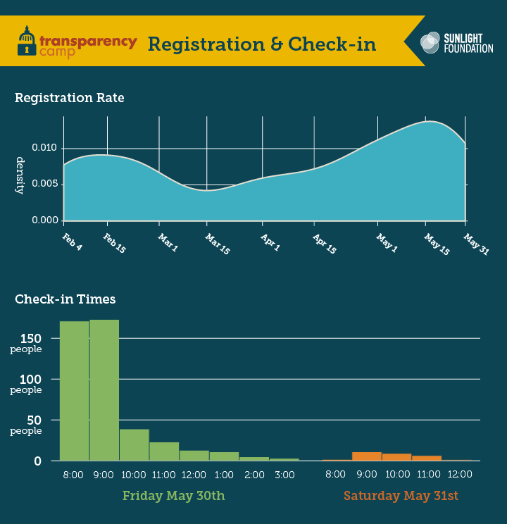
We effectively use QR codes on badges. Yes, you read that correctly. We used them to ease the crush of the check-in process. For lunch we scanned badges to collect data for the most popular food options and what options vegetarians preferred to help with decisions for the next year. We also used the codes for participants who borrowed computer dongles, and to track them down when they did not return the equipment.

Signage & Wayfinding
Another design challenge I faced was how to make the conference look and feel like a friendly camp. We used big, bold swatches of color and very large wayfinding signage. Velcro arrows allowed the signs to be flexible and relevant to account for unexpected changes during the event.

Sunlight Foundation's directional signage for TransparencyCamp
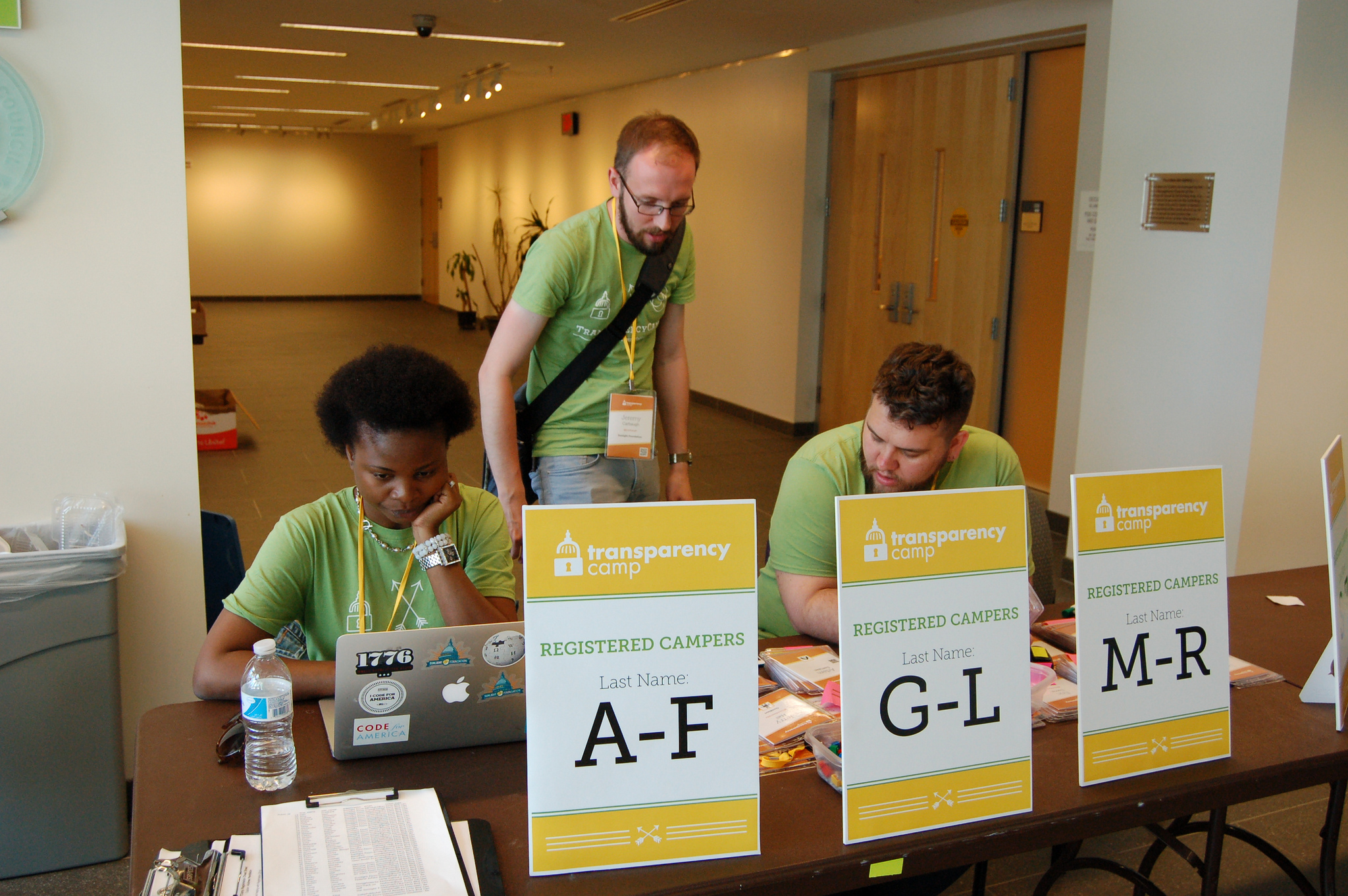
Registration desk signage helped people find their badges quickly
Wallace the robot and mascot
One of the design elements that changed over the years is the inclusion of a robot. I left it out of the branding in 2013, and participants missed this mascot. So, I fought to bring him back the following year in a new and more-awesome way. This 6ft. tall robot waved, talked and held the welcome sign. Clever developers made the animation happen, and efforts to bring the robot back paid off. People took many photos with him that further promoted the event.
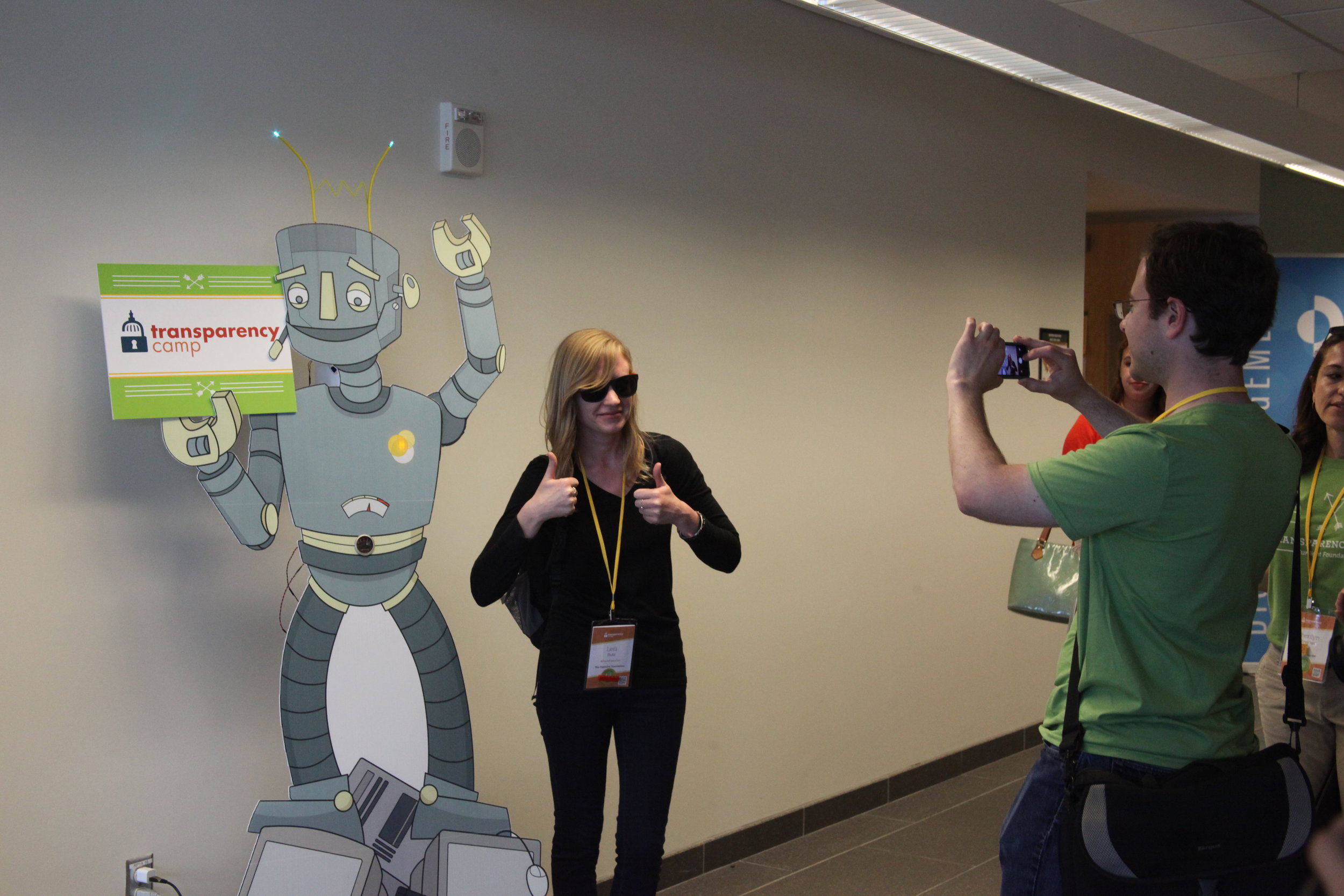
Participants took photos with Wallace to post on social media

Lunch Signage
A TransparencyCamp tradition is to provide lunch from food trucks due to its affordability and quality over catering. However, feeding 500 people with three food trucks in less than an hour is no easy feat. Signage helped make the process fun and efficient.
Menu holder volunteers show you the options, answer questions about their particular food truck, and generally try to convince you theirs is the best option. Bold text and an actual human ended up being the get the message across in an unpredictable environment. End of line signs with the name of the food truck that were passed person to person as the line grew helped participants know which line to stand in. And each truck is marked with a TransparencyCamp ONLY sign so a passerby won't attempt to get a meal.

Menu holder for food trucks

End of line sign

TransparencyCamp only signage on the food truck
Website
The TransparencyCamp website was simple and responsive. Bright colors and fun details such as ribbons and arrows bring the feel and branding of the event into the design. Because WiFi and cellular service can be strained at the event, it's a lightweight site that features the schedule on the day of the event for mobile.

TransparencyCamp website

Mobile view of the website
Infographics for wrap up blog post
Using data from the custom iPhone app and registration site, we pulled together some big numbers as well as a few charts. Full blog post and more infographics at: Being Transparent about TransparencyCamp