
Sunlight Foundation Data Visualization Style Guidelines
Style Guidelines specifically for charts and graphs for the Sunlight Foundation. Created to maintain consistency and accessibility across data visualizations created in multiple tools for the data focused non-profit.
- Date: 2014
- Role: Lead Designer
- Stakeholders: The Labs Department at the Sunlight Foundation.
- Audience: The developers, reporters and communications staff who worked at the non-profit
- Problem: Each chart was created as a individual piece. The process was slow, and the visuals did not hang together as a family or have reusable components.

I did not set out to reform data visualization style at the Sunlight Foundation. I hadn't really done much of it before taking the job, or even during the first few months. Sunlight was publishing either overly ornate infographics, which didn't flow with the analysis text, and were time consuming because each piece had its own unique style and branding, or visually unappealing R exports which didn't really help explain the data to the viewer or fit with the style of our site.


It took about 9 months of doing data visualization to figure out what worked and what did not. I had to earn the trust of the analysts and learn how not to destroy the integrity of the data. I had to prove that I wasn't just "making things pretty", but adding value to the finished product by highlighting key points, and adding visual hierarchy. I had to demonstrate that charts which are well designed and professional are taken more seriously, because it conveys an attention to detail that implies similar care was taken with the data.
After figuring out colors, layouts and methods that worked, and discovering a lot about data along the way, I reached a point where I found myself going back to find what I had done last time so I could repeat the same style. And answering the same questions when coworkers wanted their charts to look more "sunlight-y". In order to bring our visuals to the next level, and save time, I, along with the data scientist help of Zander Furnas, created The Sunlight Foundation Data Visualization Style Guidelines.
- Goals: Have less design time on all charts so that time can be spent on complex charts.

"Please remember to respect the data as you go forth into the wonderful, but often confusing, world of turning numbers into visuals."
So why a guide at all?
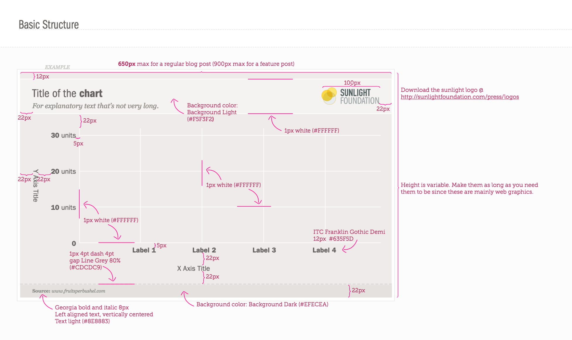
I've included not just where to put the logo (top right across from the title is the least likely place for it to be cropped out), but how far apart things should be spaced, what kind of grid lines and tool tips to use, sizing, color, font and hierarchy guidance as well as a few bullet points on when each type of visualization is useful.
The guide covers the common applications and provides guidance on basic design and branding principles all charts Sunlight Foundation makes should meet. Now, everything we make has a cohesive feel. The guidelines allowed coworkers to create templates, in R, D3, and Illustrator so far, that apply the standards.
It also allows the Sunlight Foundation to create visualizations more quickly. Instead of starting from scratch every time, there is a ready arsenal of colors and a basic setup waiting to be applied. By having a starting point of restrictions, it gives staff more freedom to create.

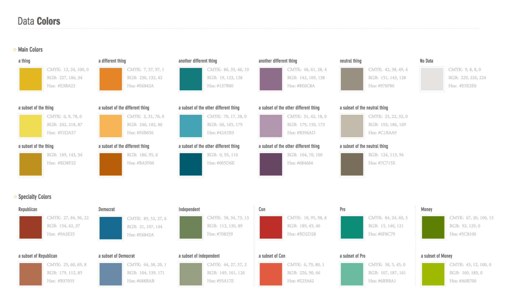
Color blindness is a big factor with data visualizations that rely heavily on color. It effects about 4.5% of the population, with red/green being the main concern. Therefore, it was important to test the color palette for color blindness and make sure our visualizations were accessible to the entire population.
Each of the colors is listed with not only a sample swatch, but what it should be used for, and it's RGB, Hex, and CMYK numbers for easy reference.

It was important to define typography that went along with our brand style guide, as well as being WCAG 2 accessibility compliant in terms of size and contrast.
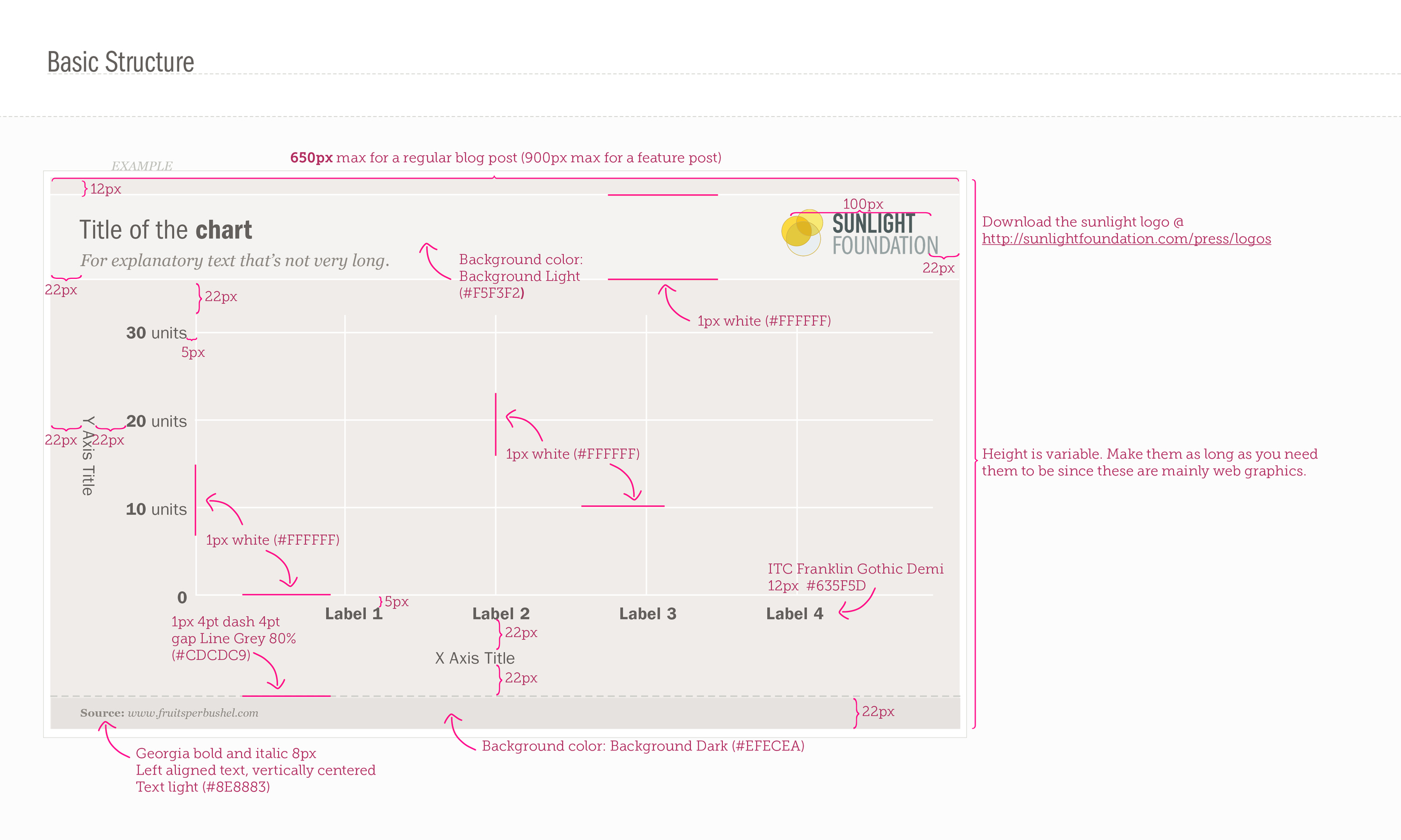
Defining the basic structure, and what elements should be included, helps the graph creator remember to add things like axis labels, and data source information, which keep the visualizations accurate. Sunlight Foundation's developers went nuts over this attention to detail and measurement, because it removes small decisions that are annoying to make each time they want to produce a simple chart.

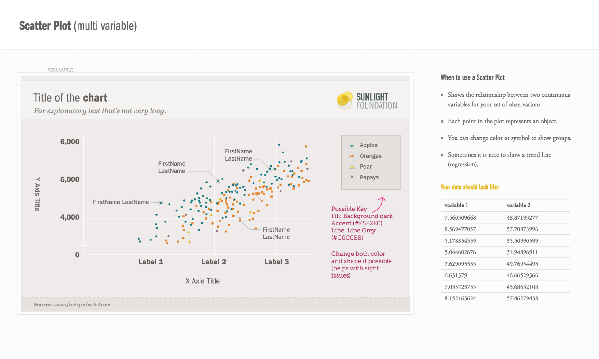
Each chart type not only shows an example, but defines when that chart type should be used, and what your data should look like. This helps our reporting team quickly decide which chart type to use, and figure out how to get their data into that visual.

Outcomes:
Is the data viz style guide working? I'd say yes. By not forcing everyone at Sunlight to adopt the same technology, but allowing them to continue using what they are comfortable with, we've had more people accept this system. It's easier to create graphics, so we've been doing it more frequently.
Our branding is stronger and more recognizable. Our charts have gotten picked up by Vox.com and Washington Post's "The Fix", because they tell a story, and they don't need to be visually cleaned up before they are republished.
Since having a style guide, designers have to do less work on the majority of data visuals, because they are already 90% done when they come to us. I also spend less time testing for colorblindness and text readability, because we’re using pre-tested options. This way, I have more time to focus on larger projects that push the boundaries of our style guidelines, and really make the visuals exceptional.

Examples of charts created after the style guide, in a variety of different tools (R, D3.js, Word and Adobe Illustrator)
Data Viz Style Guide Advocacy
In 2014, I was asked to speak at DataViz DC hosted by the Washington Post about the usage and creation of the data visualization style guide. The event was attended by over 100 people including journalists from PBS, Washington Post and USA Today.
I also gave a talk about data visualization style guides using case studies including the Sunlight Foundation one at OpenVis Conference in 2017 to 500+ people.

The original Sunlight Foundation blog post has more than 1,500 views and 280+ shares on twitter, as well as being reviewed by Andy Kirk on VisualizingData.com
Any organisation looking to optimise its data visualisation capabilities would be advised to consider this kind of light touch approach: something that manages to balance constructive instruction without over prescription. By taking away some of the groundwork thinking and fine-tuning design pain that many chart makers will experience, this should be viewed is a sensible development. Furthermore, it helps to create a consistent look-and-feel across the board of visual output which is often a key concern for many organisations.


