
Writing
Do No Harm Guide: Centering Accessibility in Data Visualization
Author of Chapter 9: Building Accessibility Best Practices Into Your Organization’s Data Visualization Style Guidelines
Data visualization style guides offer the potential to build accessibility best practices into organizational workflows and culture. Organizations, their designers, and their content teams often rely on style guides to maintain brand consistency in terms of color, font, feel, and visual style, but style guides are more than just guidelines. They can set organizational standards and function as tools for organizational process change.

Data Smellification — Smelling Data Saved My Life
We usually associate our sense of vision to how we interpret data, but we can consume data with other senses, too. How we interpreter data through smell in both natural and manufactured ways.

Writing Alt Text for Data Visualization
You probably can’t write text that conveys the entire meaning of a chart. But, that doesn’t mean that you shouldn’t try. Not writing alt text means that people miss out on content that is necessary, just because it’s visual. It means it’s not accessible.

How to Create Brand Colors for Data Visualization Style Guidelines
The colors that work for your brand usually don’t work for charts. You need more colors and a larger spectrum of tints and shades to properly make graphs and maps. You also need to be more conscious of how these colors will affect chart readability and accessibility.

What are Data Visualization Style Guidelines?
Data visualization style guides are standards for formatting and designing representations of information, like charts, graphs, tables, and diagrams. They include what (e.g. types of charts) and why (e.g. reasons for using specific colors). Templates for various tools (like Excel, R, D3.js or Tableau) often accompany a guide to show the how and to make it easy for people to apply the standards from the guide.
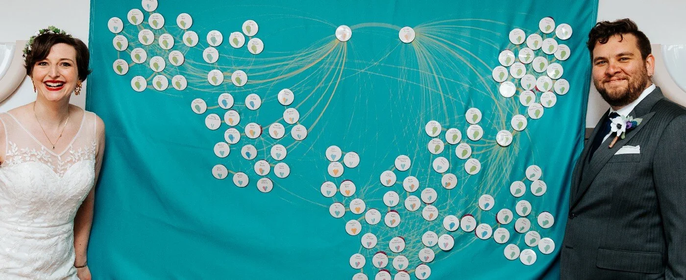
Wedding Data Viz: How We Designed for Feelings
When you meet your spouse collaborating on data visualization, you sort of have to make data viz part of your wedding. We were interested in creating a feeling. We wanted it to be clear what side they were on and whether we had a really long-standing relationship with them or they were a newer presence in our lives.

Data Visualization Society Logo: Behind the Scenes
One way to visualize the whole community is to convert them to data points, then create a simple visual that averages everyone into a cohesive mark for the logo. Since data visualization touches on many skill sets, and people come to it from different backgrounds, I wanted to to visualize each member’s unique visualization skills.

accessible data viz is better data viz
5 easy ways to make your data visualization more accessible. Being clear with text, distinctive labeling, and adding multiple ways to identify the point to your visuals will make it easier for people with impairments and those without to interpret your graphs. There are easy ways to add the principles of accessibility into your visual communications.

#DayDohViz: Play-Doh as a Tool for Data Visualization
When you’re creating every data point by hand, you get to know your data intimately. As I’ve created more of these visualizations with play-doh, I’ve tried to find and highlight the unique things about this medium.
Speaking
Why Data Viz Needs a Style Guide
An overview of what a style guide for data visualization is, and is not. Two case studies of the creation of data visualization style guides and their users.
Presented at Open Vis Conf, Chicago Data Viz Community, and for the Universal Service Administrative Co.
Writing Alt Text for Data Visualization
A quick overview on what should be included in alt text and how to write it for data visualization.
Presented at Outlier Conference
Ignite talk: Make Data Viz Easy
A 5 minute talk with slides that automatically advance every 30 seconds about the user experience of data visualization.
Presented at Ignite UX Michigan
Data Visualization for Research Scientists
Eight tips for better communicating data through visualizations using good and bad examples
Presented at University of Michigan

Panelist on the Web Presence Panel
At University of Michigan
Making Meaningful Data Visualization
Presented at ISL
Data Journalism Standards
Presented at DataViz DC
Untangling the Webs of Immigration Lobbying
Presented at Data Science DC
Interviews and Podcasts
Data Visualization Society Fireside Chat, Reflecting on the Return of the Information is Beautiful Awards, 2022
Data Visualization Society Fireside Chat, Data Viz Style Guides, 2022
Adobe Wireframe podcast, How do designers use data visualization to take the numb out of numbers?, 2021
Data Visualization Society Fireside Chat, Data Visualization Accessibility, 2021
LinkedIn Learning, Daily Practice, 2019
Data Viz Today podcast, How to Use Data Viz to Bring People Together and Feel Connected, 2019
Presentation Guild, Show Me the Numbers, 2019
Data Stories podcast, Data Visualization Society, 2019
The Good News podcast, Amy Cesal's DayDoh Project, 2018
Digital Arts, Amy Cesal’s Play-Doh infographics bring fun and colour to datavis, 2018
Data Viz Today, How to Start a Passion Project That Hones Your Skills & Opens New Doors, 2018
New America, The Rise of Data Visualization, 2018