
A visual exploration of income and financial stability in the US through the 50/30/20 budgeting method
- Date: 2016
- Role: Lead designer and data analyst. I worked with Dan Doherty who did the D3.js development
- Stakeholders: MICA Information Visualization master's class instructor
- Audience: Journalists and policy-makers reporting on income inequality
- Problem: We often hear comments that if poor people just didn’t buy iPhones or avocado toast, they would be able to save money. These types of comments illustrate people don't understand how hard it is to make ends meet, let alone save for the future on an average income.

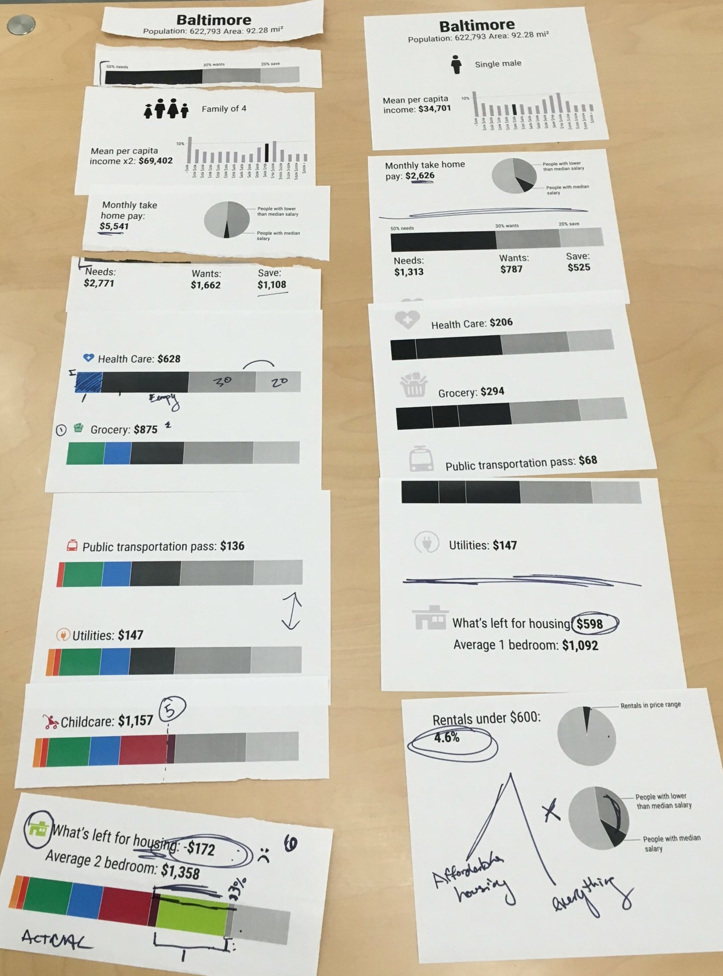
50/30/20 is a project I created for graduate school to give people a broader look into financial situations that were not their own. It is meant to illustrate how many Americans find it hard just to make ends meet, let alone save money for the future. This project was inspired by Elizabeth Warren's book All Your Worth: The Ultimate Lifetime Money Plan. In it, she introduced the financial rule of thumb that 50% of an individual's monthly income should be spent on their necessities, 30% on wants, and 20% should go towards savings and debt repayment. The tool I created uses the 50/30/20 budgeting guideline to look at average income and monthly expenses across different locations and life situations.
Goals:
use data to allow people to explore an average financial situation under a variety of constraints
allow journalists and policy-makers to see beyond their generally privileged situations
We often hear comments by politicians or opinion writers that if poor people just didn’t buy iPhones or avocado toast, they would be able to save money. These types of comments illustrate that journalists and policy-makers are far removed from the reality that even with an average income in many places it is often extremely difficult to afford essentials like housing, healthcare, childcare, transportation and food, let alone save.
Poster series
Over a series of 11 posters, this project explains the concept of 50-30-20 budgeting, which is using 50 percent of your monthly income for needs like housing, childcare and healthcare; 30 percent for wants like internet, communication, entertainment, and personal care; and 20 percent for savings and debt repayment and looks at people in a variety of situations. A special emphasis is placed on the importance of savings, and demonstrating on how difficult it can be under a variety of circumstances.
The posters were created as a proof of concept and meant to ideally be viewed in a train station or a airport so people could spend some time with them and compare the cost of living in different locations.


Interactive website
50/30/20 was translated to an interactive website with the help of my classmate at MICA Daniel Doherty. As a website, it expands the user base from just an installation piece. The interactive web-tool allows the user to explore a larger series of vignettes, like a married couple with two children in Boise, ID or a single-mom with one child in Philadelphia, PA.
For each vignette, the tool calculates what the family should be spending on needs, wants and savings given average income for their situation and location according to the budgeting system. It then calculates what they are probably spending to meet their basic needs using data from the Economic Policy Institute. This facilitates an easy visual comparison between idealized budgeting and the economic realities faced by many average Americans.
The tool breaks down likely spending in each of the major needs categories (e.g. healthcare, housing, childcare, and groceries) as the relative proportion that people must spend on these can vary considerably. The visual comparisons show how hard it can be to meet these basic needs under a wide range of circumstances, and illustrates why so many find it so difficult to save.


Download-able budgeting worksheet
Repeatedly, we heard that users wanted to look at themselves and their own finances, and not just the average American. A downloadable pdf adapted from the My Life Through Data workbook allows people to visualize their own data and see how they compare to the 50/30/20 budgeting system.


Outcomes:
This project was accepted and demoed at the 2017 Tapestry Conference, an invitation only conference of journalists specializing in data visualization. It also made Andy Kirk's The best data visualisation content published in March 2017 round-up blog post.
This project won a silver Information is Beautiful award in 2017.